Info section
Add help text and info boxes to the Panel to help your editors
The info section is perfect for any kind of static text that you want to place in a Panel layout. It can be used for general info, help, warnings and other guides for your editors.
Example
title: Gallery

sections:
  info:
    type: info
    headline: Info
    text: |
      Please double-check the licenses and sources
      of all images before you upload them to the gallery.
Using KirbyText
Since 3.3.0
In addition to markdown, you can use KirbyText in your info text, even including images:
info:
  text: |
    Check out the (link: help text: help pages) for details
Section shortcuts
Since 3.3.0
For simple sections that are only used once per blueprint, you can use shortcuts. In its most basic form, an info section consists of the section type as name, and the text property with the information you want to show.
sections:
  info:
    text: Some text
Keep in mind that the same section name can only be used once per blueprint.
Info section vs. info field
The info section behaves pretty much like the info field. Why do we have both of them? Because both are useful. The info field can be placed in a field grid and is perfect to offer help within a form. The info section can be placed anywhere else, especially in layouts that don't need form fields.
Section properties
| Name | Type | Default | Description |
|---|---|---|---|
| headline | – | The headline for the section. This can be a simple string or a template with additional info from the parent page. | |
| text | – | ||
| theme | string |
– |
Headline
The headline will be displayed above the info section. You can pass a simple headline as a string or you can provide translations for multiple languages, if you have an international editing team.
Single language
headline: This is some very important informationMultiple languages
headline:
  en: Attention
  de: Achtung
  es: Attencion
Placeholders
You can inject information from the current page into the headline with template placeholders using our query language.
headline: "{{ page.title }} Information"Text
The text can be a simple string, Markdown, KirbyText or HTML. Just like the headline, the text can also be translated. You can also use Kirby's query language to query text from some field or show some other information.
Single language
text: InfoMultiple languages
text:
  en: This is some very important information
  de: Das ist eine wichtige Mitteilung
Multi-line text
If you want to write multi-line text with paragraphs, you have to use a special YAML syntax for it.
text: |
  Dear Edith,

  this is some multi line text with paragraphs.

  Cheers,
  A. Dmin
Text queries
text: "{{ kirby.page('somepage').text()->kt() }}"
text: "{{ site.index.count }}"
text: "{{ site.index.images.count }}"
Themes
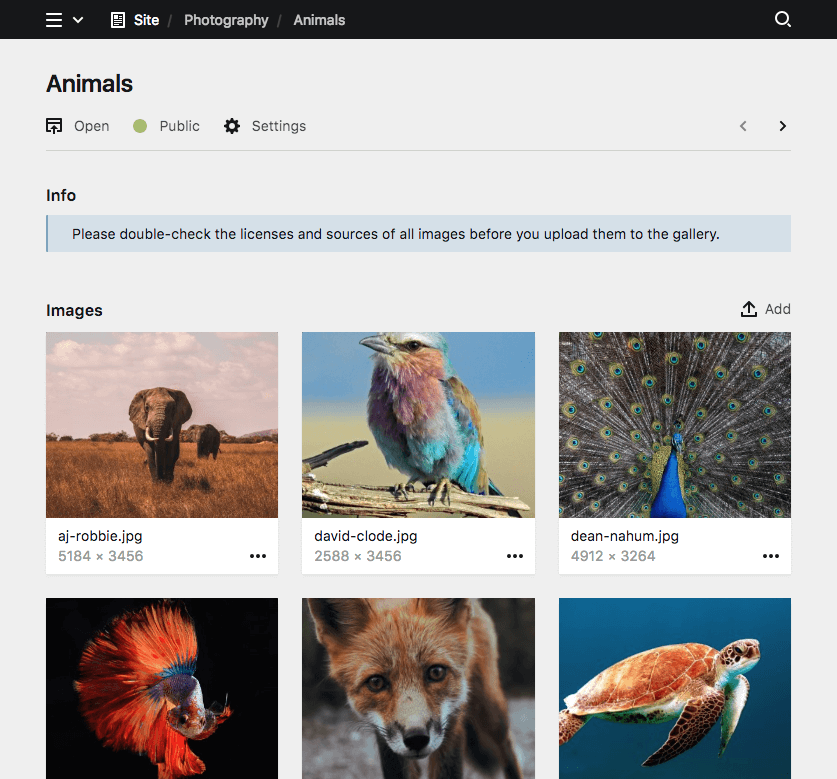
info
title: Gallery

sections:
  info:
    type: info
    headline: Info
    theme: info
    text: |
      Please double-check the licenses and sources
      of all images before you upload them to the gallery.
negative
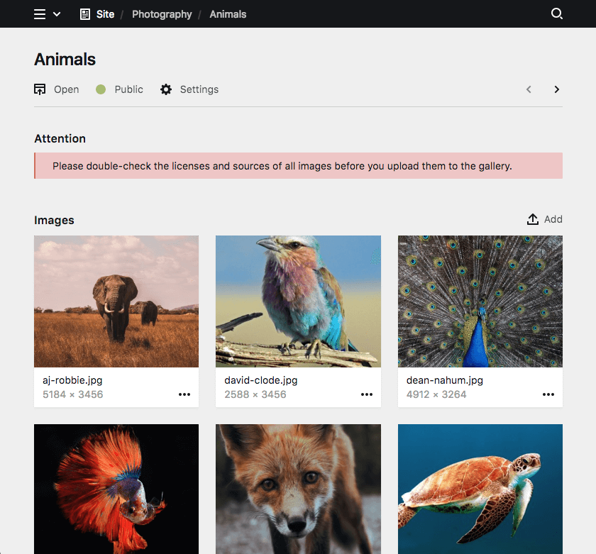
title: Gallery

sections:
  info:
    type: info
    headline: Attention
    theme: negative
    text: |
      Please double-check the licenses and sources
      of all images before you upload them to the gallery.
positive
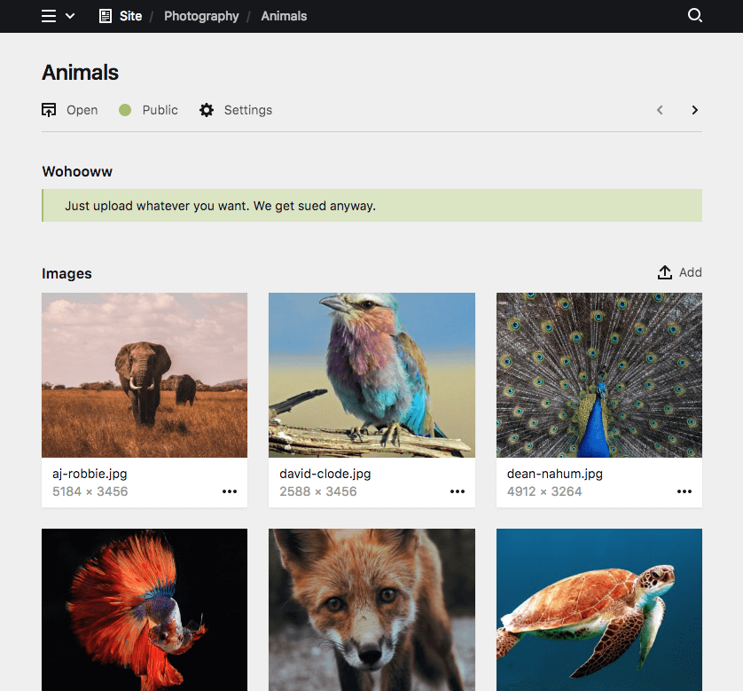
title: Gallery

sections:
  info:
    type: info
    headline: Wohooww
    theme: positive
    text: |
      Just upload whatever you want. We get sued anyway.
Disable theming
Since 3.3.4
You can disable the infobox theme entirely to show neutral text.
fields:
  info:
    type: info
    headline: Info
    theme: none
    text: |
      This is a very neutral message
Conditional sections
Since 3.2.0
Like conditional fields, sections can be shown/hidden based on the value of a given field (i.e. if a toggle is checked, a select field is at a certain option, etc.).
The condition for displaying the section is set with the when option. In the when option you define a field name as the key and the required value of that field. In the following example, the each section type is shown based on a different value of the postType field:
sections:
  content:
    type: fields
    fields:
      postType:
        type: select
        options:
          - Gallery
          - Image
          - Text
  gallery:
    type: files
    template: gallery-image
    layout: cards
    size: tiny
    when:
      postType: Gallery
  image:
    type: files
    template: single-image
    max: 1
    layout: cards
    when:
      postType: Image
  text:
    type: fields
    fields:
      text:
        type: textarea
      tags:
        type: tags
    when:
      postType: Text