Panel login
With the login plugin type you can customize Kirby's default login screen or replace it with your own. This is perfect when you want to theme the form, add additional information or links or implement your own authentication methods.
Examples
import LoginScreen from "./components/LoginScreen.vue";

panel.plugin('my/auth', {
  login: LoginScreen
});<template>
<form @submit.prevent="login">
<k-fieldset :fields="fields" @submit="login"></k-fieldset>
<k-button type="submit" icon="check">Authenticate</k-button>
</form>
</template>
<script>
export default {
computed: {
fields() {
return {
phone: {
placeholder: "+49 ",
label: "Phone",
type: "tel"
}
}
}
},
methods: {
login() {
/** Send 2FA auth link **/
}
}
};
</script>Since 3.5.0
Kirby 3.5+ also allows extending the login form with your own markup (e.g. logos, contact information, links etc.):
import LoginScreen from "./components/LoginScreen.vue";

panel.plugin('my/auth', {
  login: LoginScreen
});<template>
<div class="my-login-form">
<h1>My awesome login form</h1>
<!-- reuse Kirby's login form -->
<k-login />
<a href="mailto:admin@example.com" class="my-login-form-link">
<k-icon type="email" />
Contact
</a>
</div>
</template>
<style lang="scss">
.my-login-form h1 {
margin-bottom: 2rem;
}
.my-login-form-link {
display: block;
text-align: center;
font-weight: bold;
}
.my-login-form-link .k-icon {
margin-bottom: .25rem;
}
</style>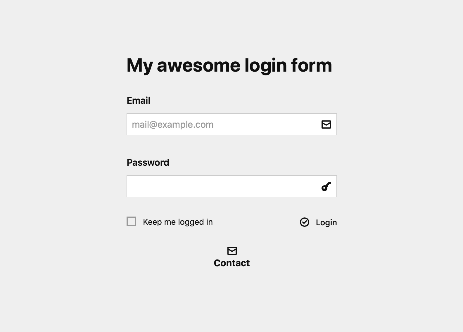
If you want to replace the whole login form with your own logic, you can still do that like before. In the meantime we are working on a new plugin extension to register additional forms to toggle between so you don't have to replace the whole form in the future. Stay tuned!