Textarea
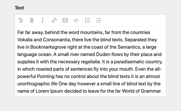
A textarea field, which auto-resizes and has built-in format buttons.
The textarea field creates a textarea for longer texts with automatic resizing and optional format buttons.

Example
fields:
  text:
    label: Text
    type: textarea
Field properties
| Name | Type | Default | Description |
|---|---|---|---|
| autofocus | bool |
– | Sets the focus on this field when the form loads. Only the first field with this label gets |
| buttons | true |
Enables/disables the format buttons. Can either be true/false or a list of allowed buttons. Available buttons: headlines, italic, bold, link, email, file, code, ul, ol (as well as | for a divider) |
|
| counter | bool |
true |
Enables/disables the character counter in the top right corner |
| default | string |
– | Sets the default text when a new page/file/user is created |
| disabled | bool |
– | If true, the field is no longer editable and will not be saved |
| files | [] |
Sets the options for the files picker | |
| font | string |
– | Sets the font family (sans or monospace) |
| help | – | Optional help text below the field | |
| icon | string |
– | Optional icon that will be shown at the end of the field |
| label | – | The field label can be set as string or associative array with translations | |
| maxlength | int |
– | Maximum number of allowed characters |
| minlength | int |
– | Minimum number of required characters |
| placeholder | – | Optional placeholder value that will be shown when the field is empty | |
| required | bool |
– | If true, the field has to be filled in correctly to be saved. |
| size | string |
– | Changes the size of the textarea. Available sizes: small, medium, large, huge
|
| spellcheck | bool |
true |
If false, spellcheck will be switched off |
| translate | bool |
true |
If false, the field will be disabled in non-default languages and cannot be translated. This is only relevant in multi-language setups. |
| uploads | [] |
Sets the upload options for linked files (since 3.2.0) | |
| when | – | Conditions when the field will be shown (since 3.1.0) | |
| width | string |
1/1 |
The width of the field in the field grid. Available widths: 1/1, 1/2, 1/3, 1/4, 2/3, 3/4
|
Sizes
In some section layouts, a small textarea looks lost. The size option sets an initial default height for empty textareas before auto-sizing kicks in. Available sizes:
smallmediumlargehuge
fields:
  text:
    label: Text
    type: textarea
    size: large
Toolbar
Disabling the toolbar
If the formatting toolbar should not be available, you can switch it off entirely:
fields:
  text:
    label: Text
    type: textarea
    buttons: false
Customizing the toolbar
You can also specify which buttons to show in the toolbar.
fields:
  text:
    label: Text
    type: textarea
    buttons:
      - bold
      - '|'
      - link
      - email
File upload and select
Since 3.1.0

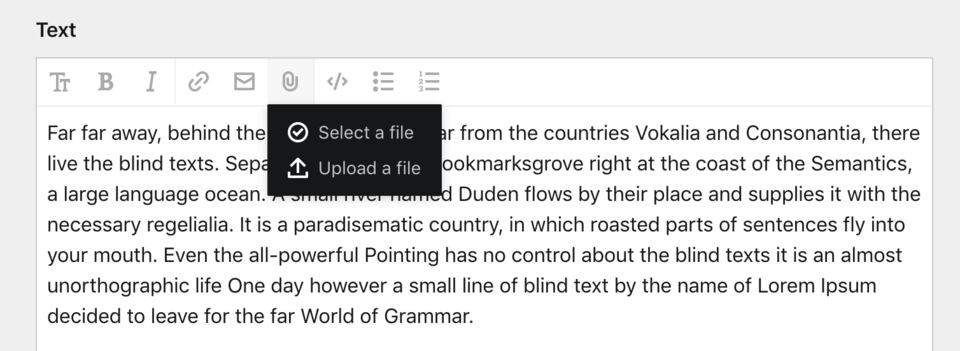
The file upload and select button is super useful if you want to embed images or other files right in your text.
You can define the button behavior with the files and uploads options:
textarea:
  type: textarea
  files: page.images
  uploads: textarea-upload
By default all files will be uploaded to the current page and without a predefined template. With the additional options you can fetch files from anywhere and upload them to specific pages. You can also control which file template should be assigned by default:
textarea:
  type: textarea
  files:
    query: site.find("media").files.template("textarea-upload")
    image:
      cover: true
  uploads:
    parent: site.find("media")
    template: textarea-upload
You can also deactivate file uploads:
textarea:
  type: textarea
  uploads: false
Length restrictions
You can control the maximal and/or minimal length of the entered text by using the maxlength and/or minlength option. A handy indicator of the current text length will be displayed in the upper right corner.
fields:
  name:
    label: Name
    type: textarea
    minlength: 10
    maxlength: 1000
Monospace
Since 3.2.0
You can set the font option to monospace, for example for fields that contain code:
fields:
  text:
    label: Text
    type: textarea
    font: monospace
How to use in templates/snippets
The usual way to render the value of a textarea field is using the kirbytext() method (or the shortcut kt()).
<?= $page->text()->kirbytext() ?>
<?= $page->text()->kt() ?>
However, there might be situations, where you want to parse KirbyTags, but not render block level elements:
<p><?= $page->text()->kt()->inline() ?></p>For more field manipulations, check out Kirby's field methods.