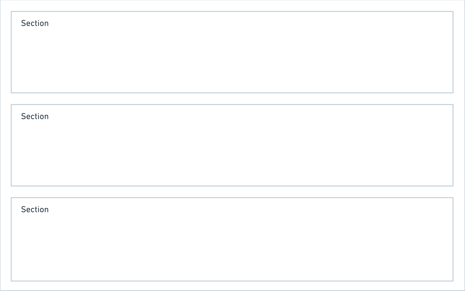
Layout
With blueprints you can create highly customized layouts that display the perfect interface for any type of data.
A blueprint layout is made up of columns, and each column can hold any number of sections. Kirby ships with the following section types:
You can combine those section types in any way you like and also use multiple sections with the same type in a single blueprint layout.
For one page type you might need a list of all subpages, files and a few form elements, whereas for the next page type you just need subpages or a gallery. With sections, all this is possible.
A closer look at pages sections
Show subpages as cards or list, add additional info for each page, control the card design – there are hardly any limits.
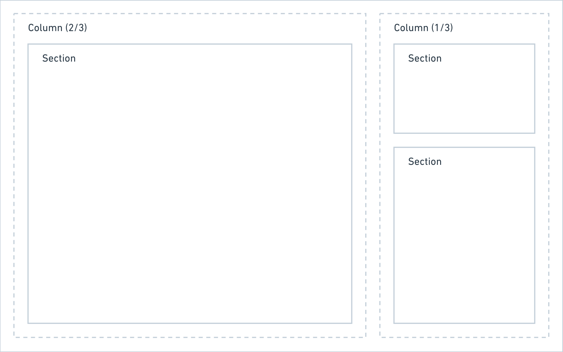
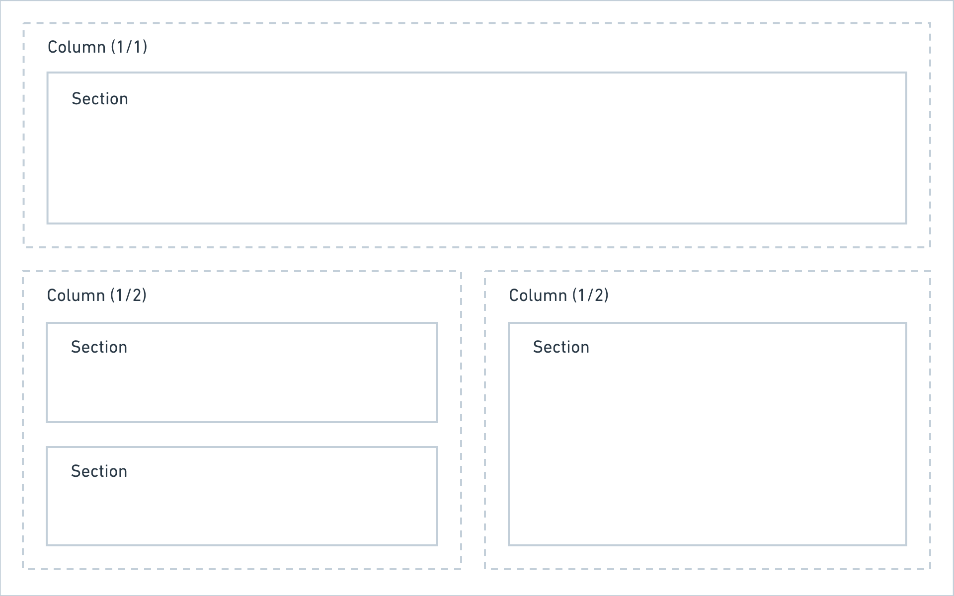
Defining columns
Columns can be defined in two ways:
Named columns
title: My blueprint

columns:
  left:
    width: 2/3
    sections:
      # sections in the left column
  right:
    width: 1/3
    sections:
      # sections in the right column
Unnamed columns
title: My blueprint

columns:
  - width: 2/3
    sections:
      # sections in the left column
  - width: 1/3
    sections:
      # sections in the right column
If you want to extend columns, you have to use named columns.
The following widths are available when defining columns:
1/2, 1/3, 1/4, 2/3, 2/4, 3/4
Since 3.3.4
Sticky columns
You can make an entire column sticky. This can be handy for a setup with a smaller sidebar that should always be available, even when you scroll.
columns:
  - width: 1/3
    sticky: true
    sections:
      # sections in the sticky column
Adding sections
Once you have set up your base column layout, the fun part begins and you can now add some sections.
title: My blueprint
columns:
# main
main:
width: 2/3
sections:
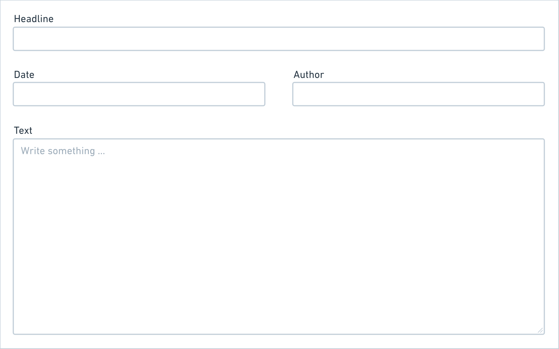
# a simple form
content:
type: fields
fields:
headline:
label: Headline
type: text
text:
label: Text
type: textarea
# sidebar
sidebar:
width: 1/3
sections:
# a list of subpages
pages:
type: pages
headline: Subpages
# a list of files
files:
type: files
headline: FilesResult
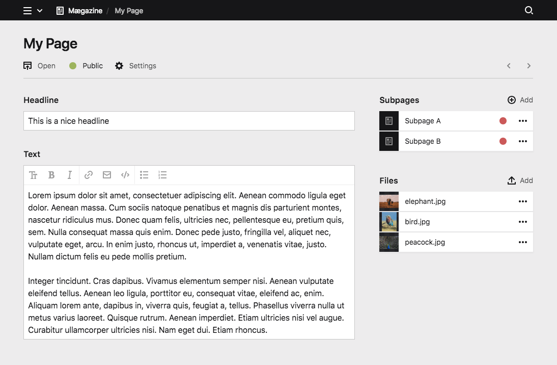
You can probably already see how flexible this is. By slightly changing the columns, we can change the interface drastically.
Sidebar on the left
title: My blueprint

columns:

  # sidebar
  sidebar:
    width: 1/3
    sections:
      # a list of subpages …
      # a list of files …

  # main
  main:
    width: 2/3
    sections:
      # a simple form …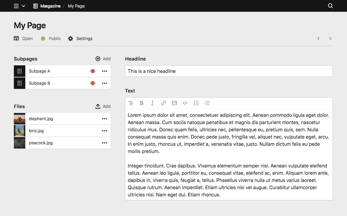
Two Sidebars
title: My blueprint

columns:

  # sidebar left
  sidebar_left:
    width: 1/4
    sections:
      # a list of subpages …

  # main
  main:
    width: 2/4
    sections:
      # a simple form …

  # sidebar right
  sidebar_right:
    width: 1/4
    sections:
      # a list of files …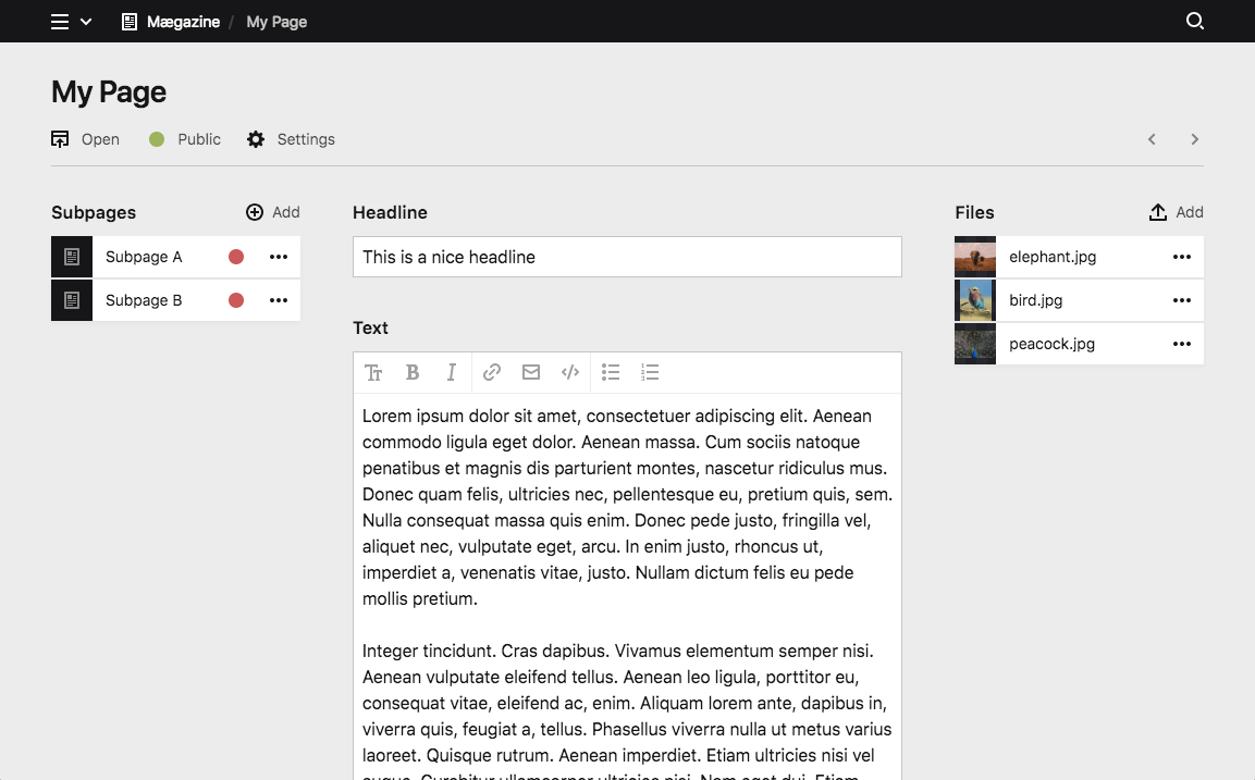
Single-column layouts
If you don't need multiple columns, you can keep your blueprint a lot shorter by using the sections option instead of defining columns. This will automatically create a single-column layout for you, where all sections are listed below each other.
title: My blueprint

sections:
  drafts:
    type: pages
    headline: Drafts
    status: draft
  published:
    type: pages
    headline: Published pages
    status: listed
Just some fields
Some blueprint types don't even need sections at all and a simple form is enough. In this case you can make your blueprints even shorter and add the fields definition directly without defining sections or columns.
title: My blueprint

fields:
  headline:
    label: Headline
    type: text
  text:
    label: Text
    type: textarea
Adapt all to your needs
Kirby gives you the flexibility to set up the Panel, so that it adapts to the needs of every single page/template. Use the layout possibilities to create the structure that works best for you:
title: My blueprint

columns:
  gallery:
    width: 1/1
    sections:
      gallery:
        type: files
        layout: card
        ...

  review:
    width: 1/2
    sections:
      drafts:
        type: pages
        status: draft
        ...
      review:
        type: pages
        status: unlisted
        ...

  published:
    width: 1/2
    sections:
      published:
        type: pages
        status: listed
        ...
There is more…
If this isn't yet enough ways and space for you to structure your sections and fields, move on with tabs.